Tacta
— Naming & Identity
We developed a naming strategy rooted in a dual sensory experience: the onomatopoeic rhythm of striking solid wood (tac-tac) and the tactile action of touching or feeling. Based on this conceptual axis, we created a typographic emblem composed of essential, upright forms that pay homage to the raw material.
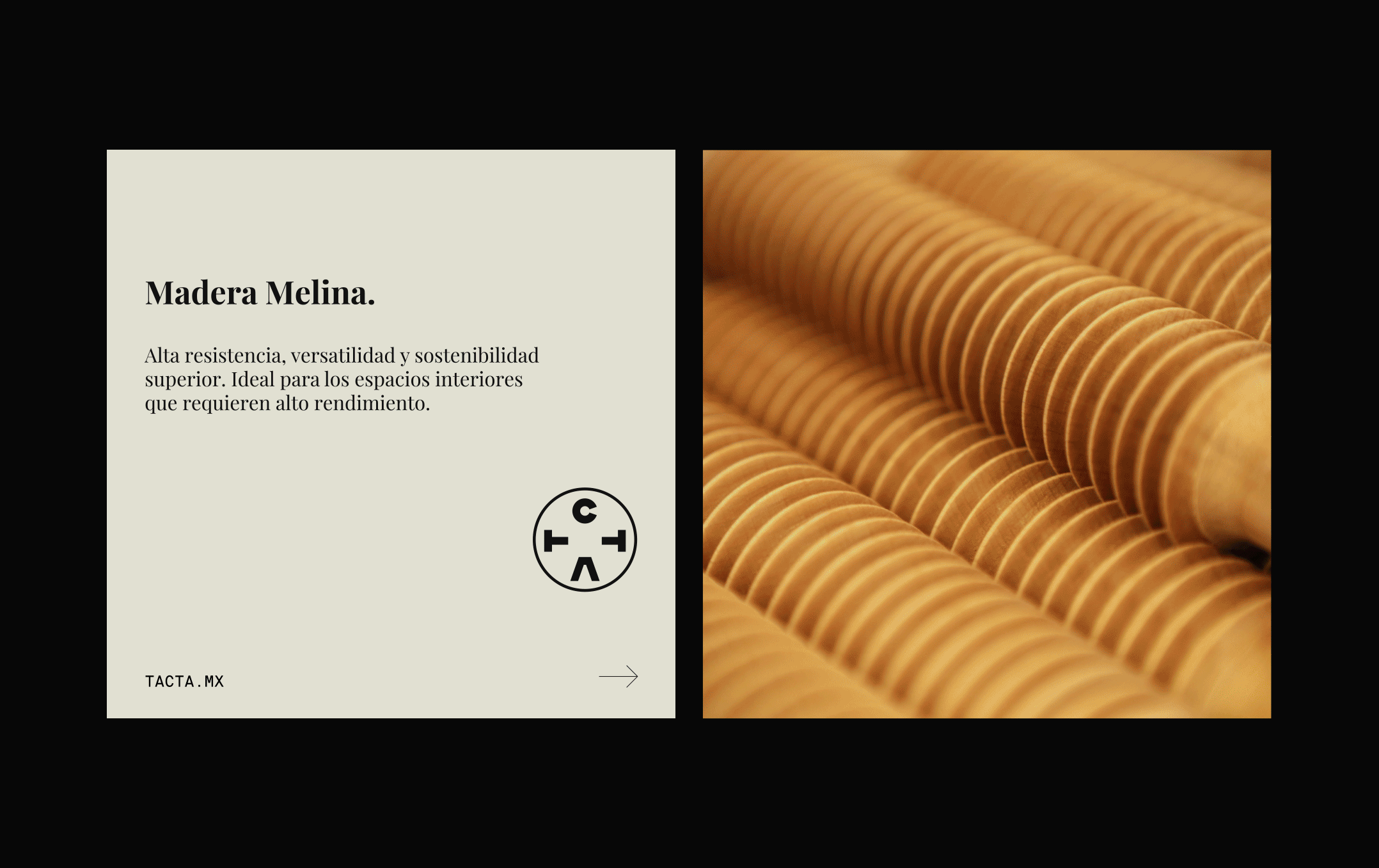
The visual narrative transitions from timber in its brutal state toward the sophistication of a functional object. Through a visual language that dialogues with the sharp angles of brutalism and the monolithic strength of pre-Hispanic monuments, Tacta’s identity presents itself as a contemporary interpretation of the ancestral. The logo transcends the obviousness of letterforms to become a visual code—one that preserves legibility while suggesting a structure that can almost be perceived through touch.
Credits
—
Violeta Hernández
Scope
—
Naming
Art & Creative Direction
Graphic Design